Five Great Free Font Combinations for Invitations
Category: All About Wedding Invitations | Published on: Jan 14, 2016
Editor’s Note: This post was originally published on April 3, 2014, but it’s been updated with awesome new tips and helpful links!
One of the most challenging choices when customizing an invitation? Picking the right fonts. Not only are there thousands out there, but it can be challenging for any non-designer to pick fonts that go well together.
Font Types
One of the basic rules of combining fonts is to pick fonts from different types. The idea is that if you’re going to use different fonts, make them really different! (You know, so they know it was on purpose!) Here’s an extremely basic primer on the most common font types:
- Serif: The most classic type. A serif is a small “foot” that sticks off the bottom or top of letters. An easy example is Times New Roman.
- Slab Serif: Similar to Serif, except these fonts are darker, bolder, and squarer.
- Sans Serif: These are the clean, modern-looking fonts. They don’t have any serifs. If you’re reading this post on my website, it’s set in a serif font. A common example is Helvetica.
- Script: The fancy ones! Modeled after calligraphy and cursive, these fonts are classy, elegant, and oh-so-fun.
- Decorative: Decorative fonts are really anything that doesn’t fall into the above categories. You can get away with two decorative fonts, as long as they’re really different, and legible.
Making the Perfect Pair
If you’re going to make a great font match, first you need to figure out what look you want. Elegant? Rustic? Techno? Vintage? Some fonts are timeless, but others are very reminiscent of a time or theme. Use that to your advantage!
I recommend starting with one. Find that perfect font you know you want and play with it! Test out different combinations to see what works.
When looking for your second font, there’s a couple things to keep in mind. You should have one highlight font and one body font. Your highlight font can be as wild and wacky as you want. On the other hand, the body font needs to be legible in paragraphs and at small sizes.
Check out a few examples to see what I mean:
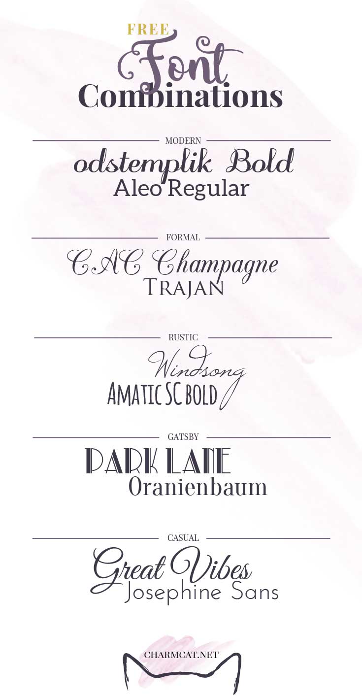
Typefaces Shown:
- Odstemplik: download here.
- Aleo: download here.
- CAC Champagne: download here.
- Trajan: download here.
- Windsong: download here.
- Amatic: download here.
- Park Lane: download here.
- Oranienbaum: download here.
- Great Vibes: download here.
- Josefin Sans: download here.
All of the fonts shown are available for free, so have fun!
— Ashleigh
See more posts about: design, font, font combinations, font faces, free fonts, how tos, invitations, typography, wedding design
Comment Policy
Be nice. If you’re not, we’ll remove your comment and ban you from the conversation.
Please check out our Welcome Policy.
Leave a Comment